Graphic design in GIMP: make a clean digital poster
Build one clear poster from canvas setup to delivery, keeping the text, photograph and contrast panel editable.
GIMP is a good choice for graphic design built around photographs and a fixed pixel canvas: digital posters, thumbnails, banners and social graphics. Set the final dimensions first, keep the photograph and text on separate layers, then save an XCF master and export a PNG or JPEG. I'd choose it for a photo-led poster because masks and editable text make revisions manageable. For a logo that must remain vector artwork or a long document, choose a vector or page-layout application.
The project below makes a 1080 × 1350 px poster with a headline, a photograph and a details block. Those dimensions, the 60 px margins and the suggested type sizes are practice choices, not upload specifications or a print-ready template. The menu names follow GIMP 3.2.

Decide what the finished graphic must do
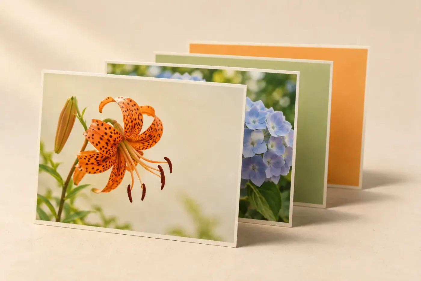
Before opening a filter, write down the message and the destination. A reader needs to recognise the subject, understand the headline and find the next action. For this exercise, use “NIGHT GARDEN”, a flower photograph you have permission to use, and a short date-and-venue line. Replace the example wording with real details before publishing.
GIMP's own description places it in a desktop publishing workflow alongside Inkscape and Scribus. That is the useful boundary: GIMP can prepare the photograph and a finished pixel composition; a scalable vector logo or multipage layout needs different working structure. A file ending in PDF is not, by itself, proof that a design contains editable vector type or meets a printer's requirements.
For an actual job, confirm the required width, height, aspect ratio, accepted file format and file-size limit first. If the destination is print, get the trim size, bleed, resolution and colour-profile requirements before making the canvas. The small digital example here should not become a large print poster simply by changing its resolution setting.
1. Make the canvas and a usable layout grid
- Choose File → New. Set the size units to px, Width to 1080 and Height to 1350.
- Expand Advanced Options. Use an RGB image with an opaque white background. Keep the standard sRGB profile for this ordinary digital example.
- Choose Image → Guides → New Guide. Add vertical guides at 60 and 1020 px. Add horizontal guides at 60, 260, 300, 1050, 1110 and 1290 px, making one guide at a time.
- Enable View → Snap to Guides for positioning. Save the project as night-garden.xcf in a folder with the source photograph.
The New Image controls separate pixel size from print resolution. Pixels determine the digital canvas here; changing pixels per inch does not add detail. Guide positions are measured from the top-left corner, so the vertical values leave 60 px on both sides.
| Element | Top-left position, px | Available size, px |
|---|---|---|
| Headline | X 60, Y 60 | 960 × 200 |
| Photograph | X 60, Y 300 | 960 × 750 |
| Details | X 60, Y 1110 | 960 × 180 |
This leaves a 40 px gap above the photograph and a 60 px gap below it. The grid gives every element a place before you start moving things by eye. I prefer this quiet arrangement for a first poster: the words can stay on a plain background while the photograph carries the atmosphere.
2. Bring in a photograph without stretching it
Choose File → Open as Layers and select the photograph. Open as Layers adds it to the existing composition; ordinary Open would make a separate image. Rename the imported layer Photo in the Layers dock.
Keep the original file. Before resizing, you can also select Photo, choose Layer → Duplicate Layers, rename one copy Photo original and hide that copy with its eye control. Leave only the working Photo selected. The hidden copy gives you an unscaled starting point if the composition changes.
- Select the working Photo layer and choose Layer → Scale Layer. Keep the width/height chain linked.
- Set Width to 960 px and inspect the linked Height. If the height is below 750 px, set Height to 750 px instead and let the width follow. Both dimensions must cover the frame; one may extend beyond it.
- Choose the Move tool. In Tool Options, select the layer target and Move the selected layers. Position the subject over the photo area, with enough image beyond every edge of the frame.
For example, a 1600 × 1200 photograph becomes 1000 × 750 px when reduced to the frame's height. That leaves 40 px of horizontal excess to position around the subject. This is a geometry example, not a measurement of an image-quality result.
Scale Layer changes the selected layer, while Image → Scale Image changes the whole composition. Enlarging a small source calculates additional pixels; it cannot recover detail that the source never contained. If an important edge looks soft at 100%, choose a larger source or a smaller photo area before adding sharpening.
The Move tool's selected-layers mode avoids picking a different layer through transparent areas. Check the selected row before dragging. If the dock is missing, open Windows → Dockable Dialogs → Layers.
3. Mask the photograph to the frame
The photograph should fill the 960 × 750 px area without covering the headline or details. A mask hides the overflow and leaves the source pixels available for later adjustments.
- With only Photo selected, activate Rectangle Select. Set Mode to Replace the current selection, turn off Feather edges and Rounded corners, and leave Fixed unchecked.
- Draw a rough rectangle. In Tool Options, enter Position X 60, Y 300 and Size Width 960, Height 750, using pixels. Press Enter to commit the rectangle.
- Choose Layer → Mask → Add Layer Masks. Under Initialize Layer Mask to, choose Selection. Leave Invert mask off, then click Add.
- Choose Select → None. The photograph should now be visible inside the frame, with the background visible outside it.
The Rectangle Select position and size fields give precise frame geometry. Initialising a mask from a selection makes the selected area opaque and the rest transparent. In the Layers dock, the image thumbnail and mask thumbnail sit beside each other: white on the mask reveals Photo; black hides it.
Click the image thumbnail before correcting the photograph's colours. Click the mask thumbnail when changing visibility. Painting black on the photograph itself would change the picture; painting black on its mask hides it. Our layer-mask guide covers softer edges and blending when a rectangular frame is not the right treatment.

4. Add a headline and details that stay editable
- Choose the Text tool. Drag a text box across the headline area, from the upper-left guide towards the opposite corner. Type NIGHT GARDEN.
- In Tool Options, choose an installed font, left alignment and a dark text colour. Set the size units to px. Start around 80 px, then adjust the size or insert a deliberate line break until the words fit the available area.
- Select a non-text layer before dragging another text box. Make the details box in the lower area. Add a short date-and-venue line and a clear action, such as a booking address. Start around 36 px.
- Use the Move tool's selected-layers mode to align each text layer with the left guide. Keep the text rows above Photo in the layer stack, and rename them Headline and Details.
The Text tool creates editable text layers and supports fixed-width boxes. A box wraps text at its right edge, but wrapping does not guarantee that every line fits the available vertical space. Check the last line after any wording, size or font change. A long venue name can need a different arrangement from the short example.
Give the headline the strongest emphasis, then make the date, venue and action readable without hunting. I'd shorten an overlong title before adding a second display font: the message needs room more than it needs another style. Use spacing and position to establish the reading order.
If a font or size change affects only one word, inspect the on-canvas editor. Selected characters can have their own formatting; Tool Options provides the broader text controls. Select the intended characters when changing local formatting. If the face is missing, use our font installation guide and check its licence before distributing the font file.
Keep the words as text layers. You can move a text layer directly; merging it into the photograph would sacrifice the simple route back to the wording.
5. Solve contrast with position or a separate backing
In the practice layout, the plain background should already make the words easy to read. If you move text over the photograph in a variation, try a quieter area and a suitable text colour first. Avoid a busy edge passing through the middle of a word.
When the picture still competes with the letters, add a separate backing. Select Photo, choose Layer → New Layer, name it Text backing and set Fill With to Transparency. Put that layer above Photo and below the text. The New Layer dialog adds an empty layer above the selected layer, so selecting the right row first helps keep the stack orderly.
Make a rectangular selection behind the words, choose a suitable foreground colour, then use Edit → Fill with FG Color and Select → None. Fill with FG Color fills the selection, or the entire active layer when nothing is selected. Confirm the selection and layer before filling.
Adjust the backing layer's opacity in the Layers dock until the wording is clear at the intended display size. I keep this panel separate because a changed headline often needs a wider panel or a different position. Painting directly over the photograph makes that revision harder.
6. Check the message at two viewing sizes
At 100% zoom, inspect the photograph's edges, the mask boundary and the letters. Look for an uncovered strip inside the frame, clipped text, a low-resolution source or accidental brush marks. Then zoom out until the poster is close to its likely viewing size. A technically sharp details line can still be too small to read.
Read the poster in order: headline, photograph, date, venue and next action. Check the real information, spelling and permissions. If the audience cannot tell what to do, remove competing decoration or shorten the message. An outline or shadow cannot fix missing information.
| Problem | First check | Correction |
|---|---|---|
| The whole poster changes size | Which scale command is open? | Undo the unintended operation; use Layer → Scale Layer for Photo. |
| A different object moves | Move target and selected layer rows | Use the layer target, Move the selected layers, and only the intended row. |
| The photograph vanishes when the mask is added | Mask initialisation and selection | Undo; remake the frame selection and use Selection with Invert mask off. |
| The photo edge fades unexpectedly | Feather edges and the selection used for the mask | Remake a hard-edged rectangular selection before adding the mask. |
| The last line is missing | Text box, canvas edge and font size | Enlarge or reposition the box, shorten the wording or reduce the size. |
| A colour correction changes visibility | Photo's selected thumbnail | Select the image thumbnail for colour work; the mask controls visibility. |
7. Save the master, then inspect the delivery file
Save night-garden.xcf again with the layer structure intact. XCF preserves the working image, while Export creates the delivery format; the undo history is not stored in XCF. Keep the master when sending a finished poster, and record the font names if another person will revise the text.
- Choose File → Export As and enter night-garden.png. Complete the PNG options, keeping the colour profile for this sRGB graphic.
- Open the exported file separately. Check that it is 1080 × 1350 px, that all intended layers were visible, and that the headline and details are complete.
- Check the actual file size against the destination's limit, then view the file near its audience's display size. Send this export; keep the XCF for changes.
My first export for this text-led design would be PNG: PNG compression is lossless, so increasing its compression level does not blur the letters. If the destination requires JPEG or the photographic file needs a smaller delivery copy, export a separate JPEG from the XCF and inspect the text edges. JPEG is lossy, has a preview option and cannot preserve transparency. Raising its quality to 100 does not restore a low-resolution photograph.
A different aspect ratio needs a new composition: move the text and adjust the photo frame rather than stretching everything to fit. For a proportionally smaller copy, Image → Scale Image can resample the whole design. Image → Print Size changes print dimensions and resolution without resampling; it cannot turn this digital practice file into a detailed large print. Start the next version from the editable master and its original photograph.

Elena Morris
Elena Morris is the GIMP image-editing and compositing editor at TheGIMP.net. She writes about selections, masks and layers, restrained retouching, compositing and export.