Add an outline to text in GIMP 3
Use the Text tool’s Style setting for an outline that follows your edits. Choose its colour, width and direction, or use a separate outline layer in GIMP 2.10.
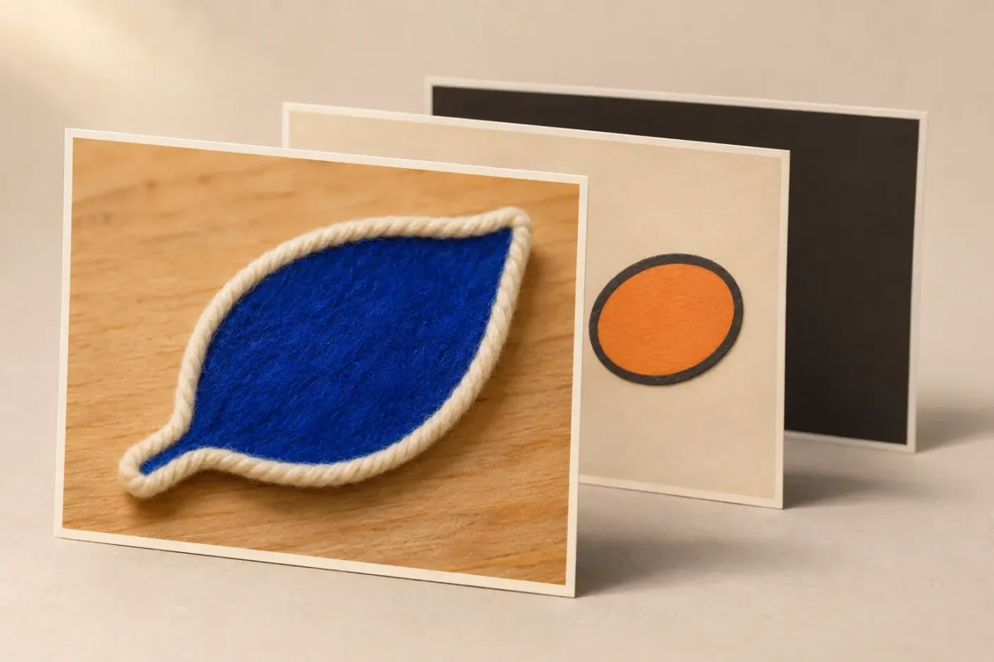
To outline text in GIMP 3, select the text layer, choose Tools → Text and set Style to Outlined and filled in Tool Options. Inside Outline Options, choose Solid color, pick the border colour and set Line width. In GIMP 3.2, choose Outer to grow the border outside the letters. I'd use this live outline for ordinary titles because the words, font and border remain editable together.
For hollow letters, choose Outlined instead. GIMP 3.0 has the live outline but only its inner direction; GIMP 2.10 needs a separate outline layer. You don't need a plug-in to complete any of those routes.
Choose the route for your GIMP version
| Your starting point | Use | What stays editable |
|---|---|---|
| GIMP 3.2, ordinary solid border | Text tool → Style → Outlined and filled; choose Outer, Inner or Centered. | The words and outline settings on the same text layer. |
| GIMP 3.0 | The same Style control for an inner outline; use a separate layer for an outer silhouette. | Live inner outline follows text; a separate silhouette needs rebuilding. |
| GIMP 2.10 | Alpha to Selection → Grow → fill a new transparent layer below the text. | The original text, provided you keep it separate from the outline pixels. |
| A soft or offset outline | Text Styling in GIMP 3. | The filter settings when applied as a non-destructive layer effect. |
GIMP 3.0 introduced non-destructive text outlines. GIMP 3.2 added outer and centred outline directions to the existing inner outline. That version difference explains why a current tutorial may show a direction control that your 3.0 copy doesn't have.
Add an outline that follows text edits
Start with a live text layer in the Layers dock. Words baked into a photograph or flattened PNG are pixels: type them on a new text layer if you need to change the wording and use the Text tool's outline controls. If the required font is missing, add the font to GIMP before styling the title.
- Select the text layer, choose Tools → Text and click its words on the canvas. For a new caption, first select a non-text layer, then click where you want to create the text and type it.
- Open the Text tool's Tool Options dock. If it's hidden, use Windows → Dockable Dialogs → Tool Options.
- Set Style to Outlined and filled. The Outline Options appear below it.
- Select Solid color inside that outline section, click its colour button and choose the border colour. The separate Color control above Style sets the letters' fill.
- Set Line width, using px to work in image pixels. On GIMP 3.2, choose the desired Outline Direction. I'd start with Outer for a filled title over a photograph: the coloured letter strokes keep their thickness.
- Keep the text and outline Antialiasing options enabled for smooth curves. Change a word to check that the border follows the text, then undo that sample edit if needed.
The Text tool's Style and Outline Options control the live border. Use that dock for the outline. The small on-canvas toolbar formats selected characters or newly typed text; it isn't the place to look for the outline controls.
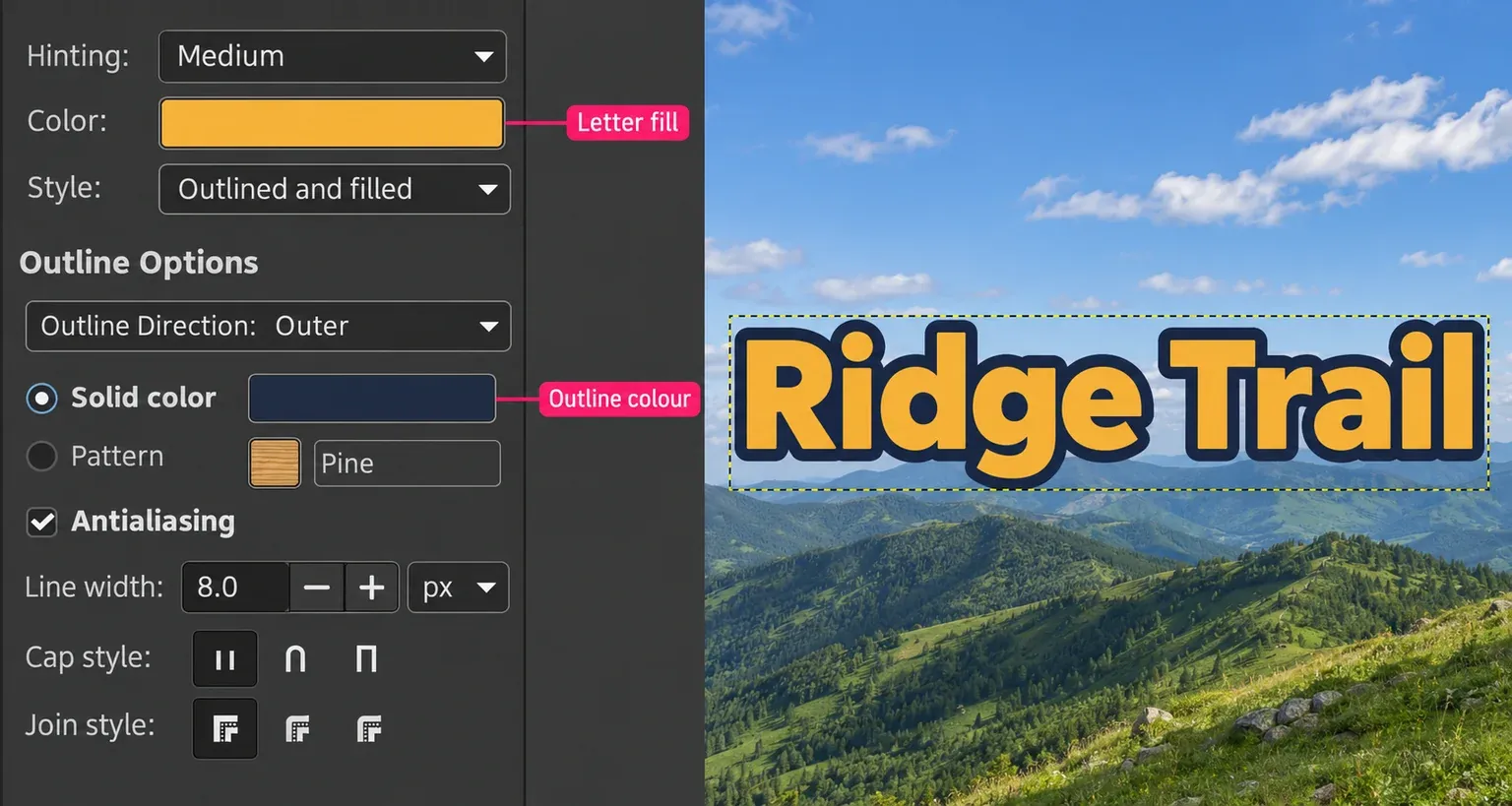
A border should separate the title from its background without closing the small holes inside letters. The 8 px width shown above is a setting for that example, not a universal preset. Judge your own text at its intended display size. If you later change the font, size or spacing, check the outline again.
Choose where the border grows
| Direction in GIMP 3.2 | Effect on the letter | What to inspect |
|---|---|---|
| Outer | Grows outside each character's original edge, preserving the fill's stroke thickness. | Holes inside letters shrink, and outlines on nearby letters can meet. |
| Inner | Grows into the letter, preserving its original outer footprint. | A wide border can cover a thin coloured stroke. |
| Centered | Straddles the original edge. | The fill narrows while the outer footprint expands. |
When letters run together, reduce Line width before increasing Adjust letter spacing. That spacing control in Tool Options changes the gaps across the text. For a local change to particular words or characters, use the text formatting controls instead.
Sharp spikes at the corners of an A or a serif usually need a different join rather than a different font. In Outline Options, try a round Join style or reduce Miter limit. GIMP's stroke settings explain how joins and the miter limit shape pointed corners. Lower the border width as well if the outline overwhelms the letter.
Make hollow outlined letters
Set Style → Outlined. GIMP paints the character edges using Outline Options and leaves the interiors transparent. You don't need an outline font, a cut-out selection or a second text layer for this GIMP 3 method.
Use the same colour, width and direction controls as for filled letters. Check the result over the background on which it will appear; the checkerboard alone can make a fine border difficult to judge. A temporary plain layer underneath helps you see both the empty interiors and the outside edge.
Hollow text on a visible white background still exports with that white background. Hide the background and any temporary checking layers before exporting a transparent PNG. Keep them in the XCF if they remain useful for editing.
Make a separate outline in GIMP 2.10 or 3.0
Use a filled silhouette below the words when your version doesn't offer the outer outline you need. Keep the live text above it. Merging the two layers removes the separation that lets you revise the wording.
For this route, start with plain filled text. On GIMP 3, set Style back to Filled and remove any outline effect you were only trying out, so you don't build another border around an already outlined result. Save an XCF copy before changing an existing design.
- Select the original text layer. Choose Layer → Transparency → Alpha to Selection. This selects its opaque letters and partially selects translucent edge pixels.
- Choose Select → Grow and enter how far the silhouette should extend. The Grow distance defaults to pixels. The 6 px shown below is an example; choose a width that suits the lettering.
- Choose Layer → New Layer, name it Outline and set Fill With → Transparency. Keep Width and Height at the image's full dimensions, with zero offsets. The new-layer dialog sets the layer's dimensions and initial fill.
- Drag Outline below the original text in the Layers dock. Keep Outline active and keep the grown letter selection.
- Set the Toolbox foreground colour to your border colour, then use Edit → Fill with FG Color. This fills the selection on the active layer. Check for the letter-shaped selection first: without a selection, the command fills the whole layer.
- Choose Select → None. Toggle the original text's eye off and on. You should see the coloured silhouette alone, then the filled letters covering its centre when the text is visible.
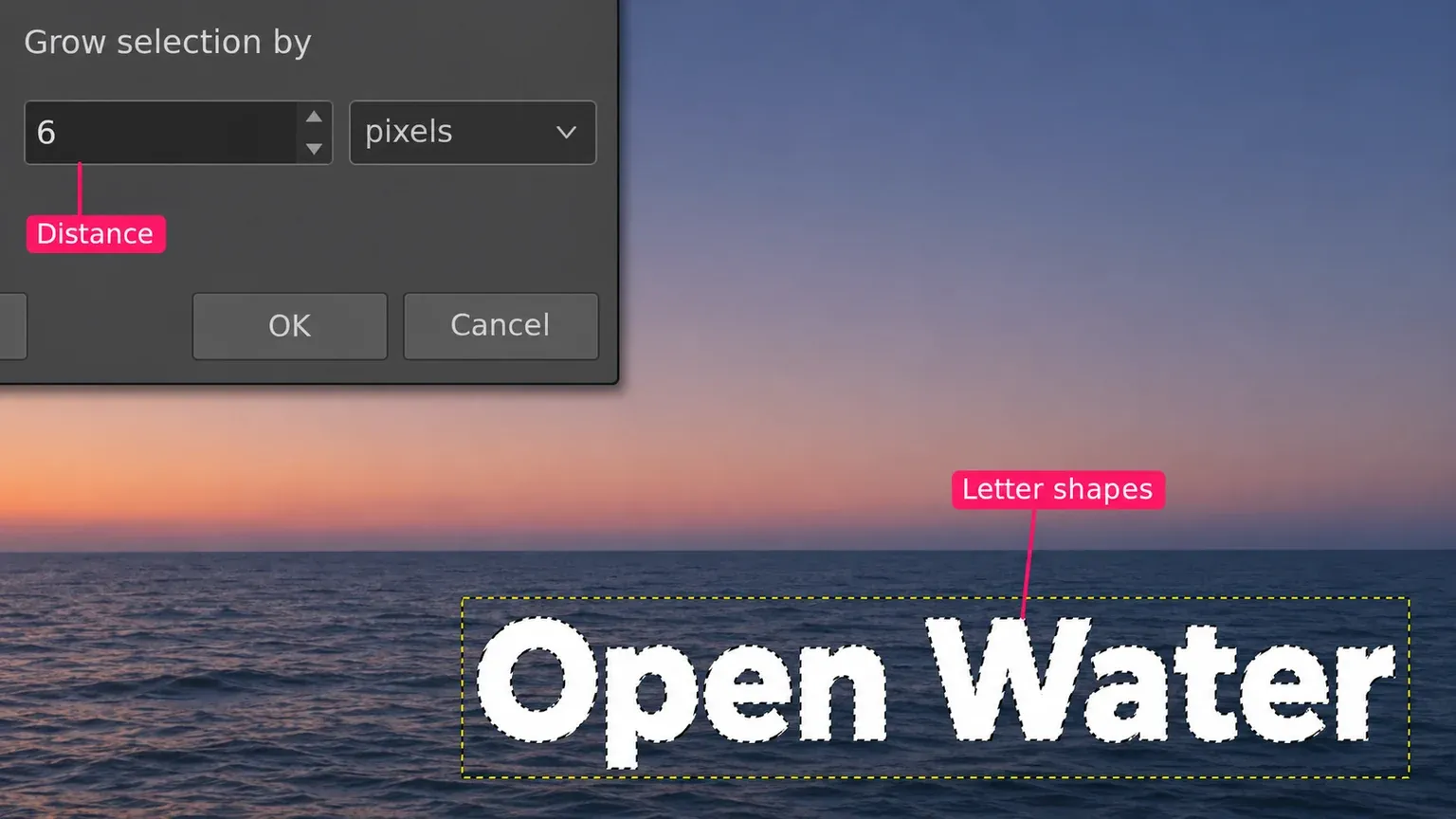
I'd use the Edit-menu fill here because it avoids Bucket Fill's choice between filling similar colours and the whole selection. If the entire title turns into the border colour, check the active layer and stacking order: the coloured silhouette belongs below the live text. Undo an accidental fill on the text layer before continuing.
The outline pixels won't follow later changes to the words, font or letter spacing. After such a change, hide the outdated Outline layer, select the revised original text and repeat the silhouette steps on a fresh transparent layer. Check the replacement before discarding the old one. Growing a pixel selection can also round corners differently from a live stroked outline.
Make hollow letters in GIMP 2.10
After making the filled Outline silhouette, select the original text and run Alpha to Selection again, without Grow. Activate the transparent Outline layer and use Edit → Clear, then Select → None. Hide the original text layer. The Clear command makes the selected area transparent on an alpha-enabled layer, leaving the outer ring. Keep the hidden text for later revisions. This pixel ring still needs rebuilding when the words change.
Control serif corners with a stroked path
If Grow changes a corner more than you want, GIMP 2.10 can stroke the font's contour instead. Select the original text and choose Layer → Text to Path. In the Paths dock, select the new text path. Make a full-image transparent layer below the text, keep that new layer active and choose Edit → Stroke Path.
Choose Stroke line and Solid color, set Line Width, and expand Line Style for the join and miter controls. The line-stroke options use the foreground colour and expose precise corner settings. Adjust the width while judging the visible border around the text above it. Keep the stroke on this separate layer; recreate its path and pixels after changing the lettering.
Add a second outline colour
For two rings, keep a smaller silhouette above a larger one, with the original text above both. Start each selection from the original plain text; that makes the requested widths easy to account for.
For example, suppose you want a 4 px white border and another 6 px of navy outside it. Make the white silhouette by growing the original text selection 4 px. Select the original text again, run Alpha to Selection again, then Grow by 10 px in total. Fill that selection navy on another new transparent layer below the white silhouette. Choose Select → None.
The stack is text → white silhouette → navy silhouette → background, from top to bottom. White covers the inner part of navy, leaving the extra outer band visible. The numbers are a worked example, not a required size. If you grow an already expanded selection by 10 px, you add that distance again and make a different border. Keep all text-related layers aligned, and rebuild both silhouettes after changing the original lettering.
Keep two outline colours editable in GIMP 3
For a title whose wording will change, I'd use two unmerged Drop Shadow effects on the same text layer. Both rings then follow the revised letters, which avoids rebuilding the pixel silhouettes above.
- Select the live text layer, set its Text tool Style to Filled and choose Select → None. Remove any trial outline effects first so you start with plain text.
- Open Filters → Light and Shadow → Drop Shadow. Set X, Y and Blur radius to zero. Choose the inner ring's Color and Opacity, then increase Grow radius above zero to make its border. These Drop Shadow controls separate expansion from blur and offset.
- Leave Merge filter unticked and confirm. Open the same Drop Shadow command again to add a second effect. Keep its offsets and blur at zero, choose the outer ring's colour and increase its positive Grow radius.
- Click the text layer's fx icon to see both effects. Select either effect and use Edit Layer Effects to adjust it. Change a word with the Text tool and check that both rings follow it.
GIMP applies layer effects from the bottom upwards, adding each new effect above the existing ones. The second shadow therefore grows around the text and first ring together; its radius adds to the first expansion. Keep that order when adjusting the two colours. Grow shape changes the corners, so inspect serifs and letter holes rather than expecting the geometry of a stroked path. Save the live text and both effects in the XCF.
Use Text Styling for a soft or offset border
In GIMP 3, Filters → Generic → Text Styling can soften the outline, shift it away from the letters or combine it with other effects. For a crisp ordinary title, I'd keep the native Text tool outline: fewer settings stand between the words and the border.
- Select the text layer and set its Text tool Style to Filled if this filter is replacing an existing native border.
- Choose Select → None, then open Text Styling.
- In Color, Outline and Shadow, choose Color policy → No Color to retain the existing fill, and tick Enable Outline.
- Choose Outline's color and adjust Outline grow radius. Set Outline blur radius to zero for a crisp silhouette or raise it for softness.
- Set Outline X and Outline Y to zero for an aligned border, or change them for an offset. Set Shadow/Glow opacity to zero when you don't want an extra glow. Keep Outline Opacity above zero so the border remains visible.
- Leave Merge filter unticked and confirm the effect. Keep the text and filter editable in the XCF.
The Text Styling controls distinguish outline size, blur, position and opacity. Unlike Line width in the native Text tool, this route grows a silhouette using its selected Outline grow shape. Inspect narrow counters and serif corners when choosing the shape and radius.
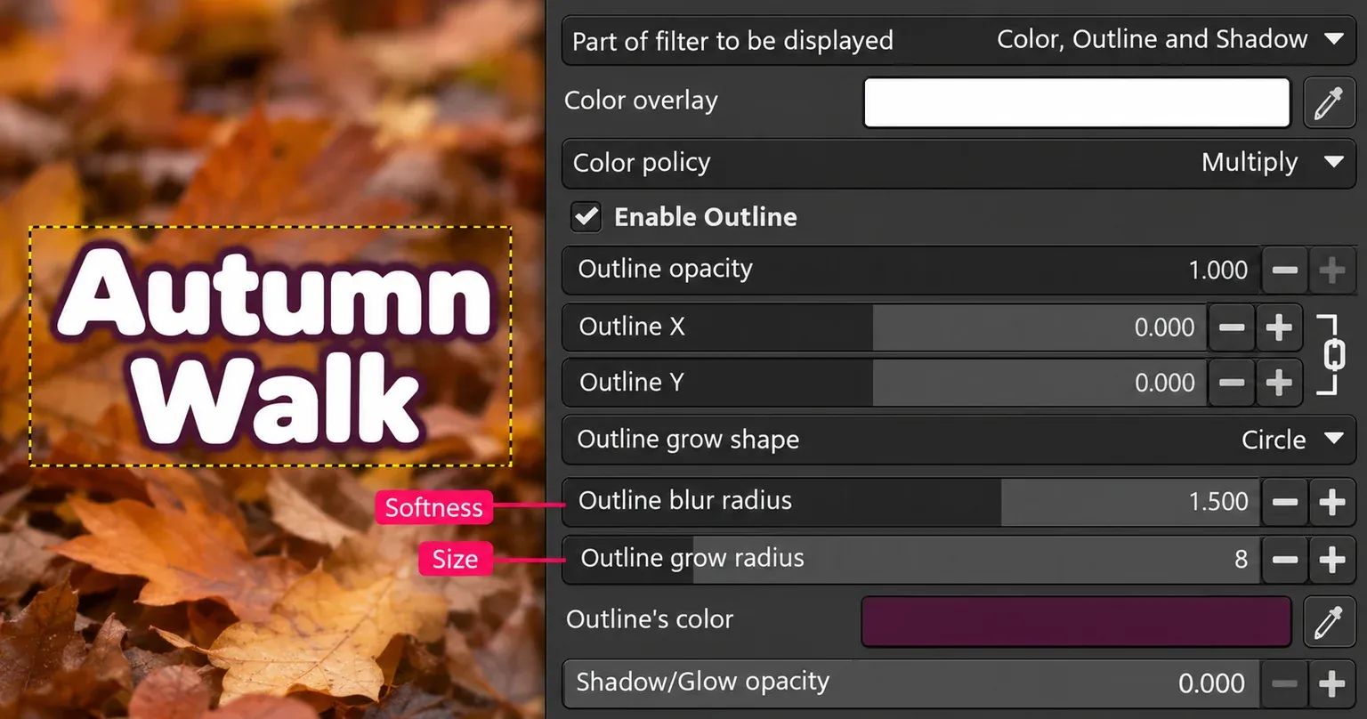
GIMP's Merge filter option applies the effect destructively when enabled; leaving it off keeps the layer effect available for later changes. In GIMP 3.2, painting on live text or merging a filter into it requires Rasterize. Revert Rasterize clears the destructive edits made since rasterising, so don't use it as a way to keep both those painted edits and editable words.
Find why the outline looks wrong
No Style control: activate the Text tool and reopen Tool Options. Check whether the selected layer still contains live text. GIMP 2.10 needs the separate-layer route; it has no native text-outline Style control.
No Outline Direction: GIMP 3.0 only offers the inner outline. Use a separate silhouette for an outer border, or use GIMP 3.2's direction control.
The fill changed instead of the border: use the Solid color button inside Outline Options. Color above Style belongs to the fill. In Text Styling, inspect Color policy if the existing letter colour changes.
A whole rectangle or only a small area gets coloured: undo the fill, select the original text and rebuild Alpha to Selection. Activate the new transparent Outline layer before filling. For Text Styling, clear a leftover selection before applying the filter so it isn't restricted to part of the title.
The edge is cut off: keep the title away from the image's outer edge and inspect where the clipping occurs. A separate outline layer should cover the full image. For Text Styling, choose Clipping → Adjust if the effect is being clipped to the layer boundary. The Clipping control appears with an alpha channel and no active selection. It doesn't create extra room beyond the image canvas.
The title is muddy or crowded: reduce the width or blur and inspect the holes in letters such as a, e and B. On a busy photograph, choose a border colour that separates the letters from the actual background behind them. More thickness isn't always more readable.
Keep the editable title and check the export
Save the working project as XCF with the live text, outline settings or separate silhouettes intact. XCF preserves the layers and editing information; exporting the finished design serves a different purpose. Keep freehand painting on another layer when the words may still change.
For a transparent title, hide the background layers, choose File → Export As and use a .png filename. Confirm the export to create the finished image. JPEG doesn't support transparency, so use it for a finished composition with a background. Reopen the actual exported file and check the border, letter holes and readability at the intended display size. The XCF remains the place to revise the wording; a flattened export won't retain those text controls.

Elena Morris
Elena Morris is the GIMP image-editing and compositing editor at TheGIMP.net. She writes about selections, masks and layers, restrained retouching, compositing and export.